We are sharing a complete history of our logo and branding changes. This is because we believe stories are so important. Sharing with others our “why,” or bringing them along in the journey helps them understand our mission. We wish more companies did this, instead of leaving it to speculation. Thus we’ll take the initiative.
Our first logo in May 2023 was a downtown cityscape view of Vancouver. The color gray symbolized timelessness and elegance. The name Carview originated from this. The “view” stems from the cityscape view of Vancouver.

Our second logo in July 2023 aimed to have our name in the logo, be simple, and “green” as a nod to electric cars. This attracted the flashy type of renters. You’ll see later on that this does not align with our current value.
After the summer in 2023, when business slowed down, we decided to lowercase our branding, to “carview” to appear more casual and fast. In fact, everything was lowercase! Even our listing descriptions looked like how flair airlines does things. Needless to say, we stopped typing in all lowercase font. This is what our logo looked like back then. Our motto at this time was “cars bring people together.”

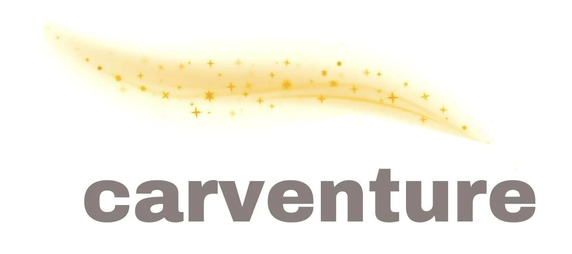
However, around this time, we started to question the name “carview.” We actually changed it to “carventure” for a period of about a week. Cars and adventure. Sounds great… right? But then, it’s better to show, not tell. Plus, not everyone is going to be going on an adventure with our car. Some are here for specific purposes, such as attending a business conference, or spending time with their family. So we changed it back pretty quickly. Here’s what “carventure” looked like briefly.
Then, in November 2023, we changed “carview” back to “Carview” to emphasize more of an experience, instead of just renting a quick car. Also, we made the color of the logo brown because we wanted to make our brand more “grounded” in our approach. The irony is that we deal with cars with futuristic technology, but that our branding looks down-to-earth, and old school. It is not flashy because we believe that most luxury car rental shops are already doing the flashy type of marketing, which doesn’t necessarily attract the right type of renters… so we want to veer away from that style.
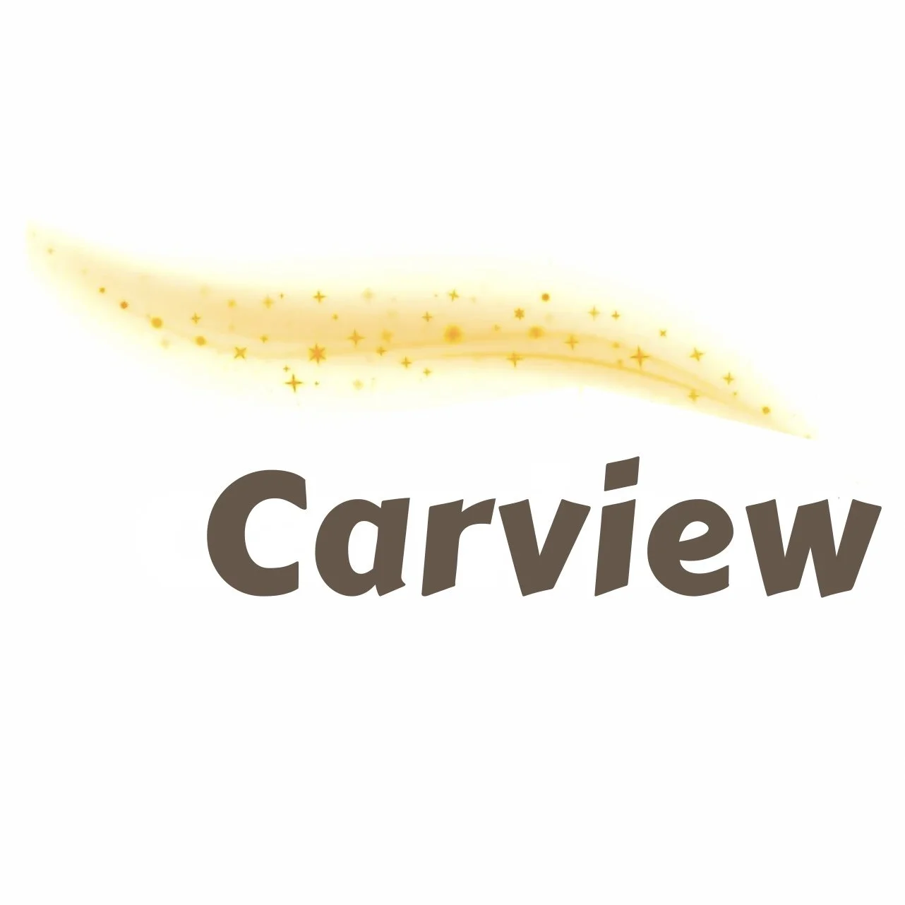
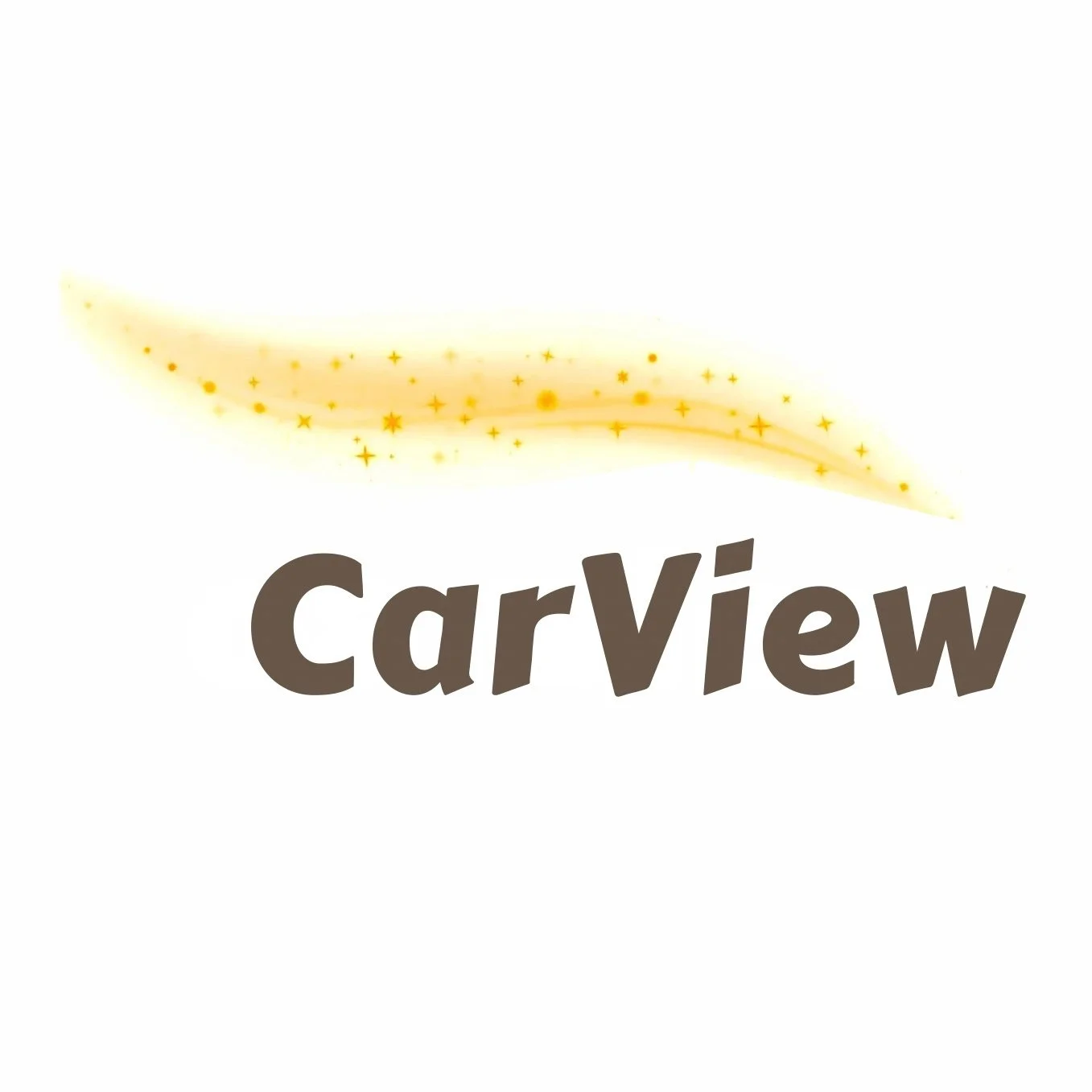
Then, in December, the logo of Carview was slightly adjusted to make the “V” a capital letter, as Carview evolved into a more professional and mature brand now. The “View” is more mission-oriented, due to the emphasis on the experience that we provide.
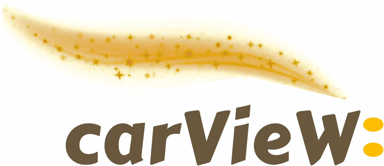
Then, in February, 2024, we made a drastic change. We added a : colon to our logo. This colon symbolizes an outward exploration from a renter’s perspective—such as visiting places and exploring cities. It represents ultimate freedom, and it takes inspiration from our time in Thailand. The colon in the logo is followed by empty space, because the world is so big, there’s so much to explore… the world is your oyster.
Carview includes the : for the locations that we operate in. For example, in East Vancouver, it will say Carview: East Vancouver. This gives attention to the beautiful nature of the cities that we operate in, and it just feels even more mission-oriented (like Mission: Impossible, or Batman: Arkham).
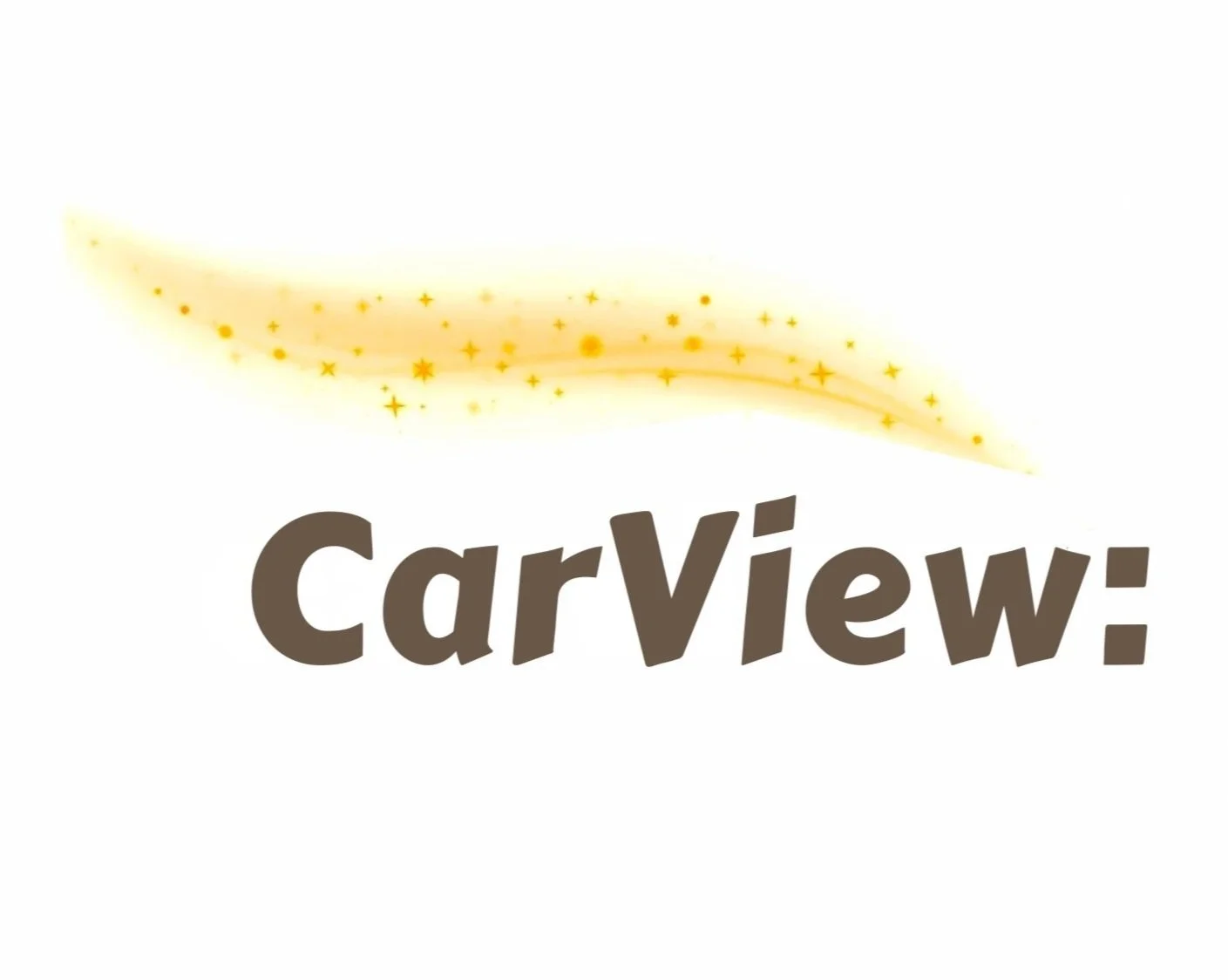
Last but not least, we made the “C” in Carview a lowercase letter. A lowercase “c” is slightly more inviting and approachable, design-wise. It also ties into our mission of convenience and speedy service. The more convenient a service is and seems, the more “badass” it is. Thus, our latest iteration.

March 2024, we changed the colon from a square looking colon, to a more rounded, oval shape. This reduces the rough-edge look of our branding and makes it looked more friendly. The oval symbolizes a more long-term outlook. We were deciding between having a circle colon vs an oval one, but ultimately we wanted to portray the oval shape because it emphasizes the "view" in Carview more. It looks kind of like an eye shape, or a car headlight shape, whichever angle you look at it from. The circle shape was too much of like "get from Point A to Point B" type of branding. Sure, that is one of our goals, as we are a transportation company, but because we deal with premium cars, it doesn't make too much sense for that to be our primary branding objective. Clients would look for Ubers, taxis, or other car rental alternatives if they just wanted to get from Point A to Point B. Also, the circular colon leaves too much to the interpretation of the client. We don't want our renters to think too much about the future, or other things when driving. We want them to be present in the moment—which is why the oval shape—which kind of resembles eyes, are more "present." Also, oval looks like Rivian’s headlights. Which, looks as if a car could say “we come in peace.”
.png)
April 2024, we changed the color of our colon to a yellow that matches the color of the streak above the carView name. We also slightly nudged the colon left, to be a bit closer to the body of the text. We actually, coincidentally realized during the last logo iteration, that the logo was starting to look like a car itself... so it would make sense to make the colon look more like car headlights.
%2520webflow%2520logo.png)
A little bit of history then gets lost in this one year, because we did keep iterating on it, changing the logo ever-so-slightly, and receiving feedback from our renters on Turo. We experimented a lot with adjusting the colors of the streak, the placement of the text, the spacing of the colon, etc.
April 2025: We spent a painstaking 17 months to complete this logo.
.png)
We wanted to encapsulate the mission and the values for Carview in the logo.
The Carview mission is dual-sided: one is to provide the best car rental experience, possible. The other is to highlight the beauty of our modern cities. We started Carview because of the views of driving in East Vancouver at night, whilst listening to our favorite music. It is truly an experience that anyone can enjoy.
The carView text is supposed to be a representation of uncertainty, of new-ness. Of mobility and motion. The undercase "c" highlights the importance of no ego, and no judgement, and to get our renters into their rental car as fast as possible.
The capital "V" highlights the importance of the "view" while driving... and what's important is the view of the cities, more than the actual car one drives.
Also, we took a lot of inspiration from the video game TrackMania Sunrise with Carview. Anyone that's ever played that game knows how nostalgically beautiful the game was. When driving the cars on the track to the finish line, the backdrop of the cities were so beautiful. So we just had to take the "sunrise" color and infuse it into our streak. We also wanted to make driving feel badass, hence why the streak color leans towards danger, dystopia, etc. And it is true--there are a lot of dangers when driving.
Believe it or not, after this, we still kept on changing the logo more, by experimenting with capitalizing the "C", and then lowercasing the "c" etc.
Then on November, 2025, we made a final change to the logo. This article explains what our logo, in its entirety, stands for: https://www.carview.rent/blog/what-our-logo-stands-for