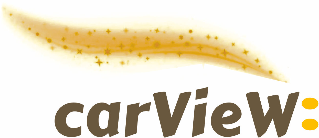
This logo was created from over 2 and a half years of obsession and thinking about it. We changed it up a bit, every single day. So while driving, we were thinking to ourselves: "how can our logo capture what it means to drive and have fun while doing so?" With over 600 iterations of the logo in our photo album, we designed it to be the most immersive; the best logo that encapsulates what it means to drive and rent a car.
.png)
The main reason why we're writing this blog is to talk about our values as a company.
First of all, the iconic golden streak. This was inspired by the video game called Trackmania Sunrise. The game features beautiful views when you're driving in the city, and we thought we'd implement a similar energy into the streak of the logo. The streak is a resemblance of flow, uncertainty, elegance, balance and poise. The streak is nudged slightly back because there is no rush. When driving, we can take our time and enjoy, and relax.
Second, the colors that we use: golden yellowish-orange, and brown oak for the text. The color of the streak is designed to be immersive and is a nod to the stars in the sky, the lights in the city, and night-driving. As, when you look closely, there are stars embedded in the streak. Meanwhile, the color of the brown oak text resembles grounded-ness.
Why did we lowercase the "c" in Carview? Well, a few reasons: we had experimented with capitalizing the C many times in the past, and it was too non-discreet, which goes against our stance on premium car rentals. Also, lowercasing the "c" is more inviting, and quick. Because at the end of the day, we want to provide a rental service that is just frictionless for the renter. The faster we can get the renter into their car and out the door, the better for them, because their time is so important.
The "V" is capitalized as we wanted to highlight the views of the city. No matter what car you're driving in, the view when driving, overlooking our culturally-rich city, is wonderful. The "W" capitalization was the final touch we made to our our logo because it symbolizes winning. The streak goes down to the "W" which can ironically, mean, "winning streak."
Last but not least, the colon in our logo. There is also a sublime quality to the colon. The colon was also supposed to connect to a city name, like Carview: East Vancouver, but sometimes you won't see us using the full name. We ended up keeping the colon in the logo. They can also double as car headlights, which symbolize a car in motion as the headlights are on, and driving itself.